Appendix 8 Treatment And Production
To
summarise my work i am going to construct a front cover, contents and double page spread of a music magazine using stereotypical conventions from existing versions.
The audience profile of my magazine is aimed at young adults and for both genders of male and female. The genre of my magazine falls into several
categories this being
electro dance and rave therefore being a niche product and have a smaller fan base.
Mise-en-scene will play a vital part when coming to the
photography. The clothing will be
extremely specific helping the fan base find the magazine on the shelf and for it to stand out. To help this the characters and actors will be dressed in stereotypical
florencant colourful clothes, looking slightly over the top. The props they will have will consist of objects found most likely at house parties for example bottles of alcohol,
cigarettes and the most common being the
instruments in this case a coloured
duck taped microphones shaped usually as a carrot, synthesizers which produce computerised
electronic sounds and finally a keyboard. The facial
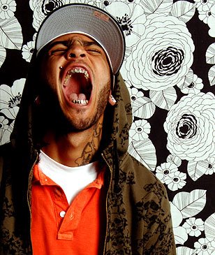
expressions present will be slightly chaotic and should
denote serious amounts of energy, these
aspects all adding to the
verisimilitude of the magazine. The locations of many of my shots will be
centred in rooms with contrasting light and give connotations of a house party. Common objects to be in the background will consist of sofas, chairs, and tables nothing too dramatic as it will take the
atension of the artists in shot. Computer games and consoles also will be present
The layout of my magazine will have all the common elements of a music magazine, this will consist of having the masthead at the top, picture centre page and all the text
aligned left for easier understanding (preferred reading). Similar to this i will have my contents stereotypically presented in
columns and have page
references to each image juxtaposing the two. The larger pictures will be their to sell the magazine, the smaller ones not as important however
appropriate to state what my magazine has to offer. The double page spread will have the theme of having all the text lower page with this an image covering the 2 pages will be essiential. One font style which will be repeated throughout the pages i am making is "28 days later" this suits the genre of magazine and looks good with bright rave colours. contrasting to this the background will be black, this will help attract target audiences.