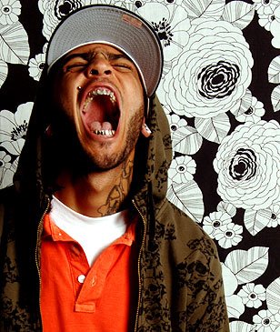
Here is a potential starting point for my music magazine drawn in rough to practise different layouts and how the mise-en-scene will effect the genre of my music magazine. To start with the clothes they are wearing have strong connotations of rave and dance type of music and overall different from typical genres of indie and heavy metal mags.
The mast head of my magazine dosent reely do anything for the magazine, however i was experimenting with the comic book style font created by myself to try and enhance an 80's type of theme. This is an aspect i may consider when producing my own.
At the top right of the front cover shows a smaller picture box of 4 more music artists, this is a good stratergy in making my magazine more appealing to the target audience as it shows it has alot to offer other than just the 3 main characters centre page.

No comments:
Post a Comment